Project 1: WorkFocus Australia Visual Brand Update
Brief: To present a 'unique-in-the-marketplace' visual approach to WorkFocus Australia's (WFA) branding. The design had to be engaging and memorable; and stand out from competitor businesses. We were also asked to re-organise the 'LogoMan' symbol and logotype relationship, so it would be readable when reproduced at small sizes.
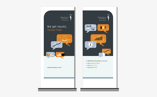
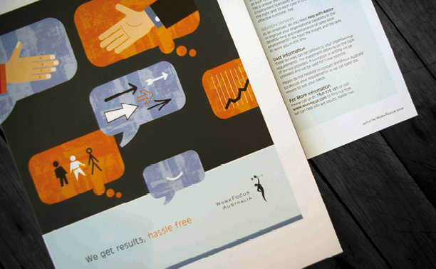
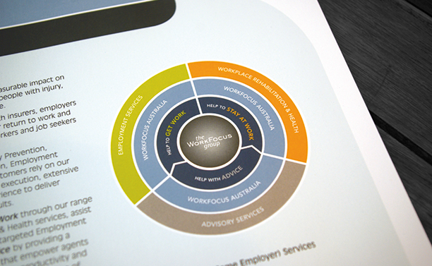
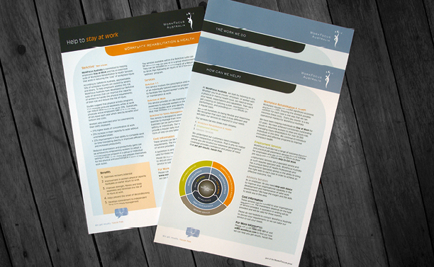
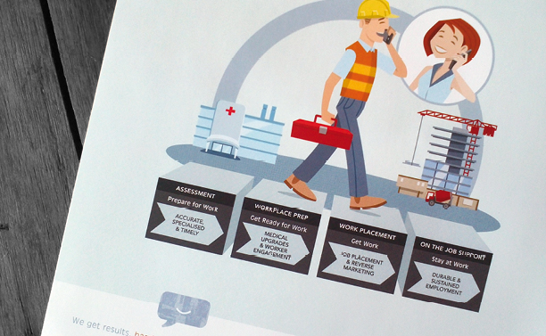
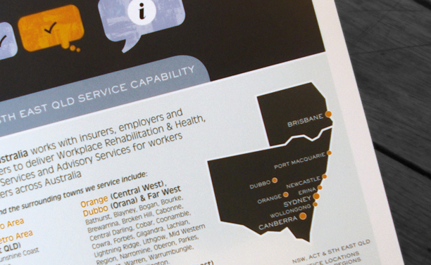
Rationale: Let's face it – nothing gets done without good communication, and face-to-face conversation is still the most satisfying way of working together and getting a job done successfully. Our modern take on a historical communication metaphor – the speech & thought bubbles – works well as a series of witty pictograms across multiple applications. Colour coding and well thought through business models, location maps and infographics helped WFA describe to their clients and employees, what they do and how they do it.