Project 1: Visual Branding
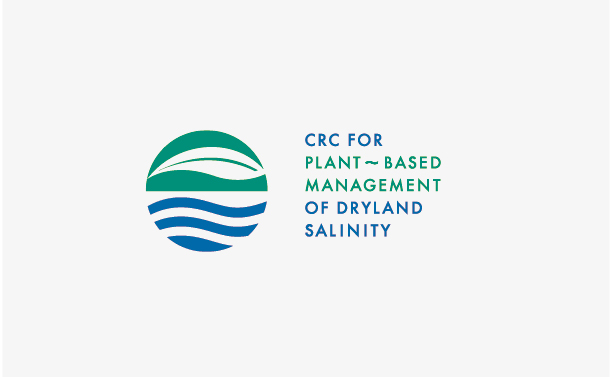
Brief: To create a logo for the Cooperative Research Centre for Plant~based Management of Dryland Salinity (CRC) which acknowledged the importance of co-planting species for the benefit of the land.
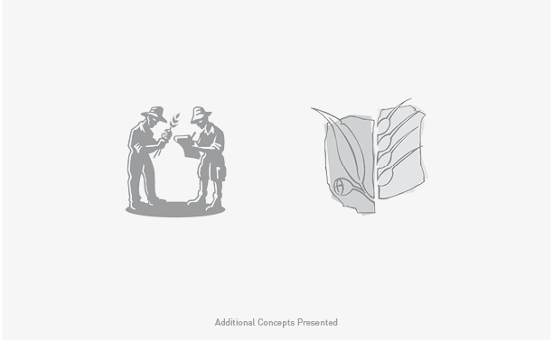
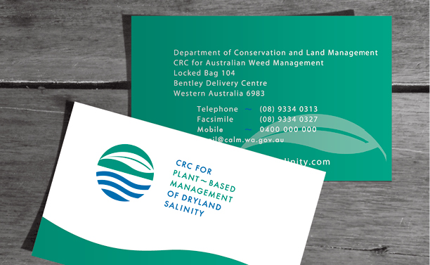
Rationale: We started the CRC’s visual branding process with the logo design and presented three quite different but all relevant concepts. The selected symbol incorporated a eucalyptus leaf, the sun, the land and the water table. The two hero colours are indicative of the natural icons they represent, while also suggesting clarity and growth. With such a long name it was important to highlight ‘Plant~based Management’ for visual contrast and also because it is the key message within the name. The end result was a visual brand that combined clean, corporate design with an appropriate colour palette and contemporary fonts. This presented the organisation as professional but not “stuffy” and allowed it to speak to it’s intended audience – farmers.